Thursday, January 31, 2013

Art Journal page: Eiffel Tower

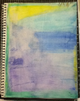
I don't really feel like this page is finished. If I had something to write, I'd probably lightly gesso out a square or rectangle on the right to write it on. But I'm drawing a blank. I mean- I could come up with something, but it wouldn't be me, if you know what I mean. Oh well. I guess I'll leave it unless I come up with something else. 

I don't have any in-progress shots this time, but it's a fairly simple page. The blue is Dylusions Spray Ink, let to dry partially and then spread out with a sponge. I tried to do the same with the green, but I couldn't get it to work in the same way, so the green is acrylic paint, thinned with water and applied with a sponge that I had cut spiky grass shaped in, to give it a streaky look. I cut a cloud shape stencil out of cardstock and used a wet paper towel to remove the blue ink from the cloud shapes. The heart is a piece of cardstock covered with strips of book paper and colored with glimmer mist. The butterfly is a sticker. And the tower is from a stencil. I traced it on a piece of cardstock and then joined up all the bits that were separated because it's a stencil. I cut it out, mostly using a craft knife. It's painted with two different colors of gray and then lightly sprayed with some Smootch Spritz in a silver color. Once it was glued down, I gave it a bit of a shadow with a black gelato and some highlights with a white gelato and used a damp q-tip to soften and blend in the gelato. I think that's everything.

I've taken quite a few pictures to show how it really looks, but my light is horrible and it's already dark out. Maybe I'll try again in the morning. Until then, here are a few of the better photos I was able to get.


Close-up to show texture
Edited to add new photo below. It's not much better, but the colors are a bit more true to how they actually look.

Monday, January 28, 2013

Project Life week 4

I think I have come up with a way of doing Project Life that works for me. If you saw my post on weeks one and two, then you'll know that I didn't really have a color theme going. I just used random paper scraps. While I liked the look it gave me (and the fact that I was using up paper scraps!), I wasn't completely satisfied. I felt like it was too random, if that's even a thing. So, for week three, I tried to do a color coordinated thing with blue and purple and it just did not work. In fact, I cringe a bit every time I look at it. I really need to redo it, but I've got so many other things I want to do that so far I've just been saying "It's done- let's move on!" Eventually, it will probably bug me enough that I'll redo it, but until then, I'm leaving it as is.

Last week, I went to Hobby Lobby when they had their loose scrapbook paper 50% off. I picked out 8 sheets of 12x12 paper that matched (or at least came close to) the year & week cards I'm using. Four sheets had dots, and the other four had this distressed textured look. I cut them to fit my baseball card sleeves (2 1/2 x 3 1/2) and got 16 from each sheet, for a total of 128.That means I got 128 for less than $2.50, which is enough for more than 14 weeks, even if I use one in each slot every week. For less than $10 I can get enough for the entire year. Obviously, if you are using the 12x12 pages, with a two page spread each week, it would cost you much more. But if you are using baseball card pages as I am, than it could work for you. You can do the same thing with any coordinating papers; this is just what I decided to do.

I love that I can still have the random, mix-and-match look that I like, but it still looks coordinated because all of the background papers are... I'm not sure what to call it. They have the same intensity of color? Hue, maybe? I'm sure there's a word for what I mean, but I know nothing about design or art, really.


The pages come together much quicker when you don't have to fret over the background. This is proven by the fact that it's Monday and I am through with last week already! It took me more time to cut out the pictures once I'd printed them than it did to pick the backgrounds. I realize that the point of the official core kits is that they are all color coordinated, but I just couldn't see spending that much on an album and the core kit and the pocket pages and whatever else goes along with it, all for something that I wasn't sure I would enjoy or keep up with. I'm enjoying it so far but we're only four weeks in- anything could happen before the end of the year!

Saturday, January 26, 2013

Duct Tape Laptop Sleeve

I made this a couple of weeks ago, and just realized that I never posted about it. I've had my laptop since September, but I never found a bag or sleeve that I really like. (Why do they insist on pairing zebra print with pink? Zebra print, I like. Pink, not so much.)
I received a package in the mail in a large bubble envelope and realized that it looked the same size as my laptop. I tried it out, and it just fit. I covered the envelope with duct tape and extended the flap as it was a bit short and I wanted it to overlap. I added some velcro closures and it was done!


Just FYI: this project took a whole roll of Duck brand Duct Tape plus about a quarter of another roll. I think each roll is 10 yards, so it took about 12 yards, maybe as much as 12 1/2.

I know it's probably not the most protective laptop sleeve, but it works for me. I'm sure it won't last forever, but then again what does?


Thursday, January 24, 2013

Art Journal page: Just Be You

I'm not sure I care for the size of my new art journal. It's 8 1/2 x 11. My last one was half that size and seemed less intimidating. It's also taking me a week to complete a page, but that probably has more to do with not being very inspired lately. I've also been spending a lot more time watching tutorial videos and looking at pictures of other people's work. I've been looking for inspiration, but mostly end up wishing I knew what I was doing.

Anyway, here's this weeks page! The writing says: By your own soul learn to live/ and if some thwart you take no heed/ if some hate you have no care/ sing your song/ dream your dream/ hope your hope/ and pray your prayer - Pakenham Beatty. I came across that poem? quote?- whatever it is, this week. I had already been thinking along the lines of "be yourself", so it really stuck with me, especially since it basically means "forget the haters; just do your own thing."


This is how it started. I had used the under-journaling technique I talked about here and this is how it came out.


I didn't like it, so I played around with it some more and finally decided just to cover it. I used a bunch of random scraps- the only thing they had in common was that they all had at least some blue.


I used a light coat of gesso over top, but wiped it off a bit in some places to let the paper show through.


Then I used a technique I saw on Pinterest. The original page is here. Basically, instead of using modeling paste through a stencil, you use a glue stick. My stencil, however had dried paint on it and the glue picked up the color, which is where the red came from. I also did it with a clean stencil, but it's not really visible in the photo. I was originally intending to stick to shades of blue, but I kind of like how the red looked and decided to go with it.


Next I used sequin waste/ punchinella with some acrylic paint. I also put a few drops of spray ink at the top of the page, spritzed it with water, and tilted the book up to make it run.


I don't have any more in progress pictures, even though I did a lot of little things here and there. I'll try to remember everything. With a very thin coat of gesso, I made a place for the poem I found and wrote that in. The Just Be You was done with a Sharpie and I traced just inside the letters with white gel pen. I added the girl- she's from a catalog- and traced around her with a white gel pen. She didn't stand out very well, so I gave her a shadow. I used a black Faber-Castell gelato. First time using it, so I had no clue what I was doing, but I just played around with it until I was happy with how it looked. I also used it around the poem and around the edge of the page to give it a more defined look.

Here's the finished piece again:


 I wasn't real sure about this page at first, but the more I look at it, the more I like it!

Project Life week 3

Here is my week 3 of Project Life. I thought I'd try to color coordinate with the date card (blue with purple dots) so I used blue and purple cardstock. I really don't like how it turned out, but by the time I was through, I was like "oh well, at least it's done." I might go back and change it someday, but I doubt it. I really do prefer the way weeks one and two turned out.

Wednesday, January 16, 2013

Art Journal page: Doodle

This is the second completed page in my new art journal. I really like how it turned out. Please excuse the awful picture. It's been raining forever and the light is horrid. In person, the background is much less washed out.


I did the background with an under-journaling technique that I first saw here. I changed it up a bit. I used watercolor crayons to journal, and when I was done, I went over it with a wet brush to obscure the writing and make my background. I used several different colors: pink, yellow, orange, and red. I really like under-journaling because I have a hard time writing anything that other people might see.

I found the girl in a magazine and doodled on her with a black pen and a white gel pen. The rest of the page was done with a couple of stencils and Sharpie-type markers and doodling with white gel pen.


The background before adding the doodling.

Project Life- Weeks 1 & 2

So this year, I've decided to do Project Life. For anyone who doesn't know what that is, you can click here. There's a video that can explain it far better than I can.

Instead of buying the fancy album and sheet protectors and cards and all that, I'm using baseball card pages because I happened to have them on hand. My brother was getting rid of a stack of them a several years ago and I couldn't pass them up. I've used them for various things, but I still have more than enough for a year of Project Life. I didn't really want to spend a bunch of money on this before I knew if I'd like it or keep up with it.

My main problem has been all the free printable journaling cards I've been downloading for the past year or so are either 3x4 or 4x6 to fit the official Project Life pages. I'm sure there is a way to print them at exactly 2 1/2 x 3 1/2, but I can't seem to get them quite right. (If you can tell me how, that would be great!) They end up a bit too small. To fix that, I went through my paper scraps and cut a bunch of them to size. I just layer the journaling cards on top.

As you'll see in the pictures, I'm not sticking to any particular color theme, although I do intend to include a 2013/ week # card and a books read this week card on every page. That leaves seven spots, one for each day, although for week 2, I didn't have something for every day so a few days have two spaces. So far, I'm happy with it.

As I said, I'm using a bunch of freebies I found all over the internet. I've been saving them for a while now and I don't know where I got most of them. If you see something of yours and you want me to give you credit, I will be glad to; just let me know. I'm not trying to take credit for anyone else's work.

With all that said, here are my pages!
Week one:


Week two:


And my (as yet unfinished) title page:
(I'll probably end up putting photos where the zebra stripes are.)

Monday, January 7, 2013

Art Journal page: Fly

I don't normally post my art journal pages individually, but I really like the one I finished today and wanted to share it.


I took a few in-progress shots, and I'll briefly explain what I did. I started with a gessoed page and glued down some random paper scraps. Over this I sprayed some Dylusions spray ink over a stencil as well as a piece of paper with some large circles punched out.


Later, I sprayed some water on the ink and with a very inexpensive paintbrush (it's actually for house painting) I took a small amount of gesso and lightly painted over the page from top to bottom, intentionally smearing the colors.


Then I just added the rest. The large butterfly was made with my Cuttlebug. After it was embossed, I colored the embossed part with a silver Sharpie. The medium butterflies are from a punch. I think it's a Martha Stewart punch, but I don't own it, so I'm not sure. They were given to me several years ago. The tiny butterflies are from a small punch that I've had for years that I think came from the Dollar Tree. The letters are scrapbooking stickers that I've had for years; I'm not sure what company they're from. The flower stems and leaves are from two different Close to My Heart stamp sets. The flowers are made with several different punches, with the large circles punched from a paper where I had been playing around with a little kid watercolor set. There's also some random rub-on bits here and there. It's hard to tell from the picture, but I outlined most everything with a white gel pen.

I didn't really have much of a plan when I started, but I love how it turned out!


Thursday, January 3, 2013

Art Journal Flip Through

Today, I made a flip through video of my main art journal of 2012. I started it on 1/1/12 and the last page was finished on 12/31/12. It's only a 90 page journal (actually 89- one page fell out. Long story!), and I could have been done with it much sooner, but I have several different journals going at the same time. Sometime in November, I realized I had less than 10 pages left and decided it would be cool to end it on New Year's Eve, since I started it on New Year's Day. Some of the pages are not so great and some of them I really like.


If you have a questions about a certain page or technique, feel free to ask! It might be helpful to take note of the time it appears in the video so you don't have to try to describe which page you mean. I can post pictures of individual pages, if anyone wants to see something close up.